Elements of Art
Line are marks made by a pointed tool: brush, pencil, pen, etc. Lines can vary in width, direction, curvature, length, or color.
I chose this photo because it has very clean lines.

I chose this painting because it shows it's strong lines and it's work with in the painting.
Shape are formed wherever the ends of a continuous line meet.

I chose this photo because its shapes with in shapes and it stands out well.

I chose this painting because of how the shape goes from the center out.
Color wheels show the primary colors, secondary colors, and the tertiary (intermediate) colors.

I chose this photo because of the way the colors just stand out from each other.
I picked this painting because of how the colors just blend off each other.
Value (Tone), or tone, refers to dark and light; the value scale refers to black and white with all gradations of gray in between. Value contrasts help us to see and understand a two-dimensional work of art.

I chose this picture because of the way it goes from dark center to light white pedals.

I picked this painting because of the way it balances the dark color and light white.
Form describes objects that are three-dimensional, having length, width, and height.

I chose this photo because of the way it pops off and the way the building stands out with the sky.

I chose this painting because of the way the people look feather back then columns.
Texture can be rough, bumpy, slick, scratchy, smooth, silky, soft, prickly--the list is endless.

I chose this photo because you can really see the texture to the tree branch.
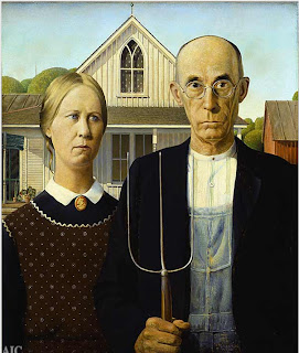
I chose this painting because you can really see the detail in the lady dress and in the background.
Space refers to distances or areas around, between, or within components of a piece. Space can be positive (white or light) or negative (black or dark), open or closed,shallow or deep, and two-dimensional or three-dimensional.

I chose this photo because you can see the space between the white and the black.

I chose this painting because of the color going from dark to more color going upward.
Principal of Design
Balance is the comfortable or pleasing arrangement of things in art. There are three different types of balance: symmetrical, asymmetrical, and radial.

I chose this photo because of the way the balance of the tree branches over balance them self.

I picked this because of the way the tress are far but balance each other for a distance.
Contrast is created by using elements that conflict with one another.

I chose photo because it shows the colors that go off each other.

I picked this painting because of how the multiple colors combined to make one painting.
Emphasis in the focal area of an artwork gives it importance. An artist may stress some elements of the design over others. The eye of the viewer will focus on the area of emphasis or center of interest first, then take in the rest of the composition.

I chose this photo because of how the color of the flowers pop out.

I chose this painting because how the one red heart really stands out on its own.
Movement in an artwork means the artist is taking viewers on a trip through the work by means of lines, edges, shapes, and colors often leading to the focal area. Movement is a visual flow through the composition. It can be the suggestion of motion in a design as you move from object to object by way of placement and position.
.jpg)
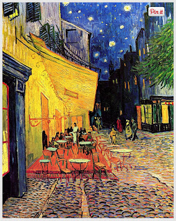
I chose this photo because it show the movement is dry and calm.

I chose this picture because of how the painting is very chill and calm.
Pattern are made in art when the same shapes or elements are repeated again and again. Pattern uses the elements of art in planned or random repetitions to enhance surfaces of paintings or sculptures.

I chose this photo because of the arrows and how they stand out with there color.
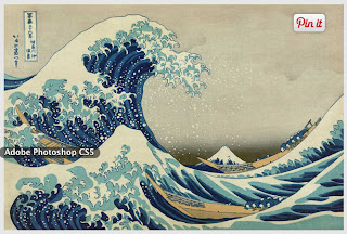
I chose this painting because of how the waves repeat and the same color.
Rhythm is the repetition of shapes, lines, and forms. Rhythm is a movement in which some elements recurs regularly.


Unity means that all elements in an artwork are in harmony. Unity brings together a composition with similar units. For example, if your composition was using wavy lines and organic shapes you would stay with those types of lines and not put in even one geometric shape.


No comments:
Post a Comment