- The theme I would use to do a mural would have to be over fashion because everyone has their own way to dress up and express them self and say its fashionable.
- The reason it would be worth it because a lot of students do take the time and effort to get ready and make a fashion statement every time they get ready for the day, also because sometimes people are concerned about whats in style and whats out.
- The advantages of using a phone camera is that you are able to send/post quicker, the disadvantages of using a phone camera is the sometimes the quality is at its best and you aren't always able to really edited things also when zooming it just makes the focus really bad.
- A advantage of using a SLR camera is that you can focus and zoom on the picture and make it look clear if you want. But the disadvantages are that you can't make the picture lack and white or use other effects on the camera cause they don't come wi the camera.
- I think we should use a SLR camera because we can just take the pictures and make them look clear and then edit them if they need any on the computer but i think the pictures will look more professional if we take it with the SLR camera than our phone camera.
Wednesday, October 23, 2013
Mural

Africa
 |
| "WOW" This would have to be my favorite photo, because this photo symbolize something strong and independent also it show a mother who is willing to protect her little ones. Not only that but I love animals with prints on them. It's an amazing photo that stands out by its self. This photo would have to be simplicity, simplicity is the quality of being easy to understand. a.) The camera he used was a Pentax ll with only two fixed lenses. b.) The reason for this photo was because of his ambition. c.) What he got by taking these photos was to really show the animals in the own state of being. d.) "The photos are my elegy to these beautiful creatures, to the wrenching beautiful world that is steadily, tragically vanishing before our eyes." |
Thursday, October 17, 2013
Academic Shoot reflection
1. What challenges did you encounter while trying to get the photos following the rules I set out for you? The challenges I had trouble with was trying to have well photo angles, also trying to get the kids to act like I wasn't in the classrooms.
2. What technical aspects of photography or the assignment in general (focus, framing, holding the camera, etc.) did you find yourself thinking about the most? I believe something I was thinking the most about was making sure my photos were on focus.
3. If you could do the assignment again, what would you do differently now that you know some basic rules of photography? Something I would do to make my photos better would be to get either closer to what I'm shooting and have better control on my focusing.
4. What things would you do the same? Possibly go to where I first took my photos.
5. When you go out with your next set of prompts, which rule do you think will be the easiest to achieve? Lines and also simplicity photos.
6. Which rule do you think will be the hardest to capture? Framing would have to be something hard to do.
7. What rule are you still not totally clear on and what can you do to figure out what that rule is? Avoiding mergers just might be the one I'm not best at, something I would do is to take more photos that have to deal with that also even practice outside of class on taking photos.
Tuesday, October 15, 2013
Academics Shoot
Lines

1. I followed this rule very well because you can see the lines in the poles and in the book shelf.
2. The subject are the lines.
3. Yes it is clean to notice.
4. I believe I followed this rule good.
Simplicity

1. I think I did well following this rule.
2. It has a simple color around the security and it shows a simple smile.
3. Yes because this photo is pretty simple.
4. Maybe it would be good to have a simple background.
Rule of Thirds

1. I think I followed this rule very well.
2. The subject is the soccer ball, all the guys around standing around waiting for it.
3. Yes it is clean.
4. If anything I should of got up a little closer.
Balance

1. This photo is a pretty good photo.
2. The subject to this photo is balance with in the kids working and others just siting there.
3. Yes this photo is pretty clean to tell.
Framing

1. I think it is kinda well followed.
2. The subject to this photo is the frame of the girl in the background.
3. Yes it clear to tell the frame in the back.
Avoiding Mergers

1. I think I did a pretty good job.
2. The subject to this photo is how all the black painting blend into and the green thing stands out.
3. This photo is pretty clean to tell.
Wednesday, October 2, 2013
Academics Shoot Preview
The Story

This tells a story because it shows ones caring and wanting to help others.
|
Action or Emotion
 This shows the girls really enjoying and being happy and also amazed by what they are doing in class.
Fills The Frame
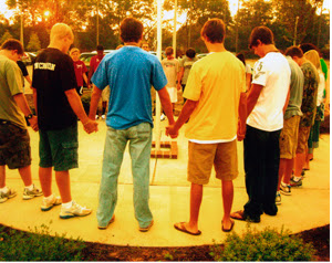
Favorite Academics Photo |
| I chose this photo because it shows how the girl is into what she is doing and also because of how the photographer was able to take a picture of the drops go up. I would have to say this photo is balance because of how it was all captured. I think I could take photos of the students in JROTC, and students in science classes also in fine arts class. The JROTC, fine arts building, gym and the able chemistry class. I will make sure I have different angles, active photo shoots, have different positions to take the picture and make it come out good. |
Photo Composition (9-11) and Reflection
The Rule of Thirds
 |
| The buildings were put on the far right and left sides while the person was put on the left center, to show perspective of the city fading to ash |
Lines

I picked this photo because there are lines going down the building that shows the man's motion, and pointing too the man. Also, there are diagonal lines that are reflections going along the side of the building
Balance
 | |
 Where you can see the two twin towers in this picture in front of it you can see on the left and right there is a half building ,tree of making frame |
Avoiding Mergers
 | |
|
Monday, September 30, 2013
Elements of Art and Principles of Design in Photography
Elements of Art
Line are marks made by a pointed tool: brush, pencil, pen, etc. Lines can vary in width, direction, curvature, length, or color.
I chose this photo because it has very clean lines.

I chose this painting because it shows it's strong lines and it's work with in the painting.
Shape are formed wherever the ends of a continuous line meet.

I chose this photo because its shapes with in shapes and it stands out well.

I chose this painting because of how the shape goes from the center out.
Color wheels show the primary colors, secondary colors, and the tertiary (intermediate) colors.

I chose this photo because of the way the colors just stand out from each other.
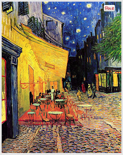
I picked this painting because of how the colors just blend off each other.
Value (Tone), or tone, refers to dark and light; the value scale refers to black and white with all gradations of gray in between. Value contrasts help us to see and understand a two-dimensional work of art.

I chose this picture because of the way it goes from dark center to light white pedals.

I picked this painting because of the way it balances the dark color and light white.
Form describes objects that are three-dimensional, having length, width, and height.

I chose this photo because of the way it pops off and the way the building stands out with the sky.

I chose this painting because of the way the people look feather back then columns.
Texture can be rough, bumpy, slick, scratchy, smooth, silky, soft, prickly--the list is endless.

I chose this photo because you can really see the texture to the tree branch.
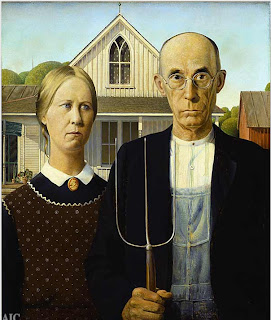
I chose this painting because you can really see the detail in the lady dress and in the background.
Space refers to distances or areas around, between, or within components of a piece. Space can be positive (white or light) or negative (black or dark), open or closed,shallow or deep, and two-dimensional or three-dimensional.

I chose this photo because you can see the space between the white and the black.

I chose this painting because of the color going from dark to more color going upward.
Principal of Design
Balance is the comfortable or pleasing arrangement of things in art. There are three different types of balance: symmetrical, asymmetrical, and radial.

I chose this photo because of the way the balance of the tree branches over balance them self.

I picked this because of the way the tress are far but balance each other for a distance.
Contrast is created by using elements that conflict with one another.

I chose photo because it shows the colors that go off each other.

I picked this painting because of how the multiple colors combined to make one painting.
Emphasis in the focal area of an artwork gives it importance. An artist may stress some elements of the design over others. The eye of the viewer will focus on the area of emphasis or center of interest first, then take in the rest of the composition.

I chose this photo because of how the color of the flowers pop out.

I chose this painting because how the one red heart really stands out on its own.
Movement in an artwork means the artist is taking viewers on a trip through the work by means of lines, edges, shapes, and colors often leading to the focal area. Movement is a visual flow through the composition. It can be the suggestion of motion in a design as you move from object to object by way of placement and position.
.jpg)
I chose this photo because it show the movement is dry and calm.

I chose this picture because of how the painting is very chill and calm.
Pattern are made in art when the same shapes or elements are repeated again and again. Pattern uses the elements of art in planned or random repetitions to enhance surfaces of paintings or sculptures.

I chose this photo because of the arrows and how they stand out with there color.
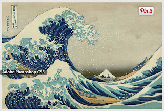
I chose this painting because of how the waves repeat and the same color.
Rhythm is the repetition of shapes, lines, and forms. Rhythm is a movement in which some elements recurs regularly.


Unity means that all elements in an artwork are in harmony. Unity brings together a composition with similar units. For example, if your composition was using wavy lines and organic shapes you would stay with those types of lines and not put in even one geometric shape.


Subscribe to:
Posts (Atom)